The Optimist’s Daughter

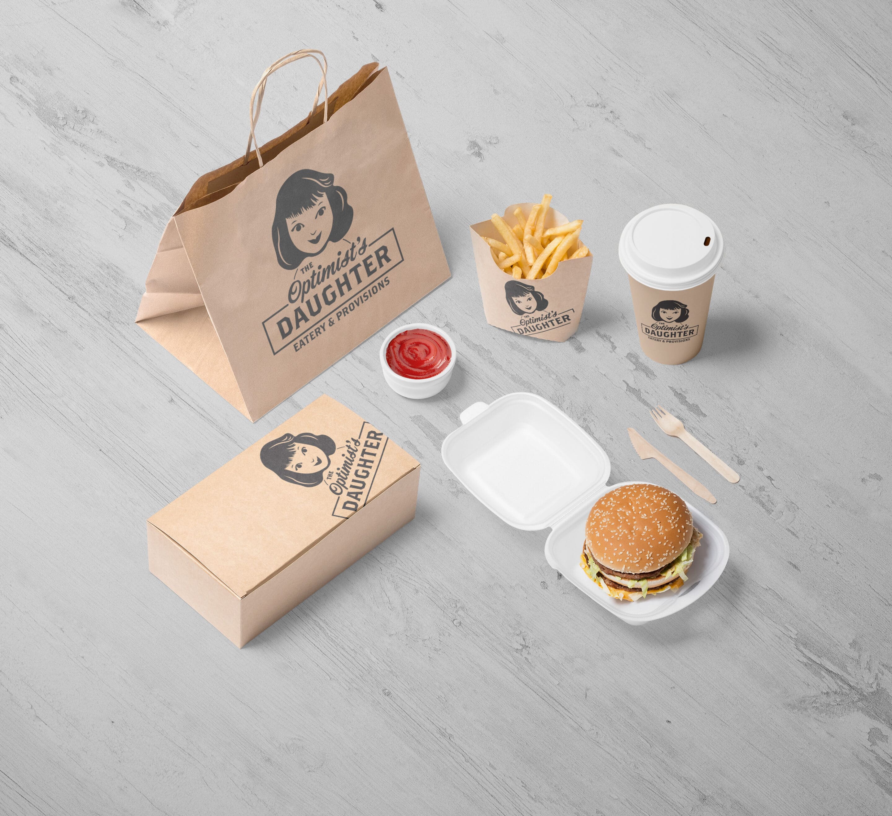
The Optimist’s Daughter was a small neighborhood restaurant with a big personality—warm, opinionated, and quietly confident. The branding needed to feel familiar without being nostalgic, and refined without slipping into preciousness.
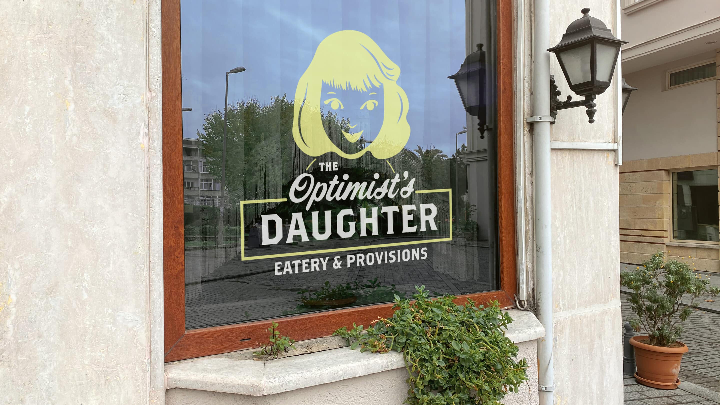
I developed a visual identity that balanced Southern warmth with a modern sensibility, drawing on literary references, restrained typography, and a tactile, analog feel. The system extended across logo design, menus, signage, and supporting materials, creating a cohesive presence that felt at home in its neighborhood while still standing apart.
The goal was not to shout, but to invite—an identity that suggested care, intention, and a sense of place, mirroring the restaurant’s approach to food and hospitality.


